
A1: CYBERCRIME CHARTING
DASHBOARD CHARTING FOR CYBERSECURITY ENGAGEMENTS
PRODUCT DESIGN, UX/UI
PROBLEM
ABOUT
OBJECTIVE
Arete is an enterprise service provider specializing in mitigating and investigating cybercrimes, including ransomware attacks and business email compromise incidents.
Building on initial research, this early phase combined design and engineering to create intuitive charting tools that bring complex threat data to life. Through agile collaboration, I designed interactive elements that simplify and clarify data visualization, enabling analysts to access real-time insights seamlessly.
While the A1 platform provided an overview of cybersecurity engagement metrics across various users, it lacked the flexibility and granularity needed for detailed analysis and user-specific insights. Additionally, the platform’s charting behavior caused confusion among users.


TL;DR
Claims Professionals expressed a need for a quick and comprehensive overview of engagements by type. They emphasized the importance of having a single visualization that could provide both the total number of engagements and a breakdown of engagement types within a selected time frame.
The goal was to develop a cohesive and dynamic cybersecurity engagement visualization tool within A1 that accurately charted and reflected engagement quantities within a selected calendar timeframe. This tool enhanced users' understanding of cyberattacks, improved decision-making, and increased workflow efficiency for insurance claims professionals.
RESEARCH
TAKEAWAYS
I started by analyzing the platform’s existing charting behavior, with a focus on how data most relevant to Claims Professionals was performing, displaying, and interacting. The main engagement chart does not update concurrently with the selected time frame, limiting precise, real-time analysis. The default display and calendar presets also fail to support comprehensive data comparisons across various date ranges, negatively impacting users’ experience.
Since Claims Professionals are the primary users of these charts, research interviews were conducted with them to gain deeper insights into their specific needs, preferences, and pain points related to engagement data.
UTILIZATION OF ENGAGEMENT DATA
Engagement tracking and documentation
Risk assessment and mitigation
Policy development and adjustments
Data analysis, reporting, & client education
MAJOR PAIN POINTS
Difficulty visualizing large data sets quickly
Fragmented data representation
Unclear actionable insights
Limited customization and filtering optionS
Data Snapshot
"When I log in, I want to see the most recent data, especially the last six months, to get an immediate snapshot of current trends and activities."
Hover-over Tooltip
"It would be really helpful if I could hover over the graphs and see detailed information, like the total number of engagements and a breakdown by type, without clicking through different views."
USER GOALS
QUICK ENGAGEMENT OVERVIEW
ability to quickly access a comprehensive overview of all engagements
ENGAGEMENT BY TYPE
wants a clear breakdown of engagement types within a selected time frame
SINGLE VISUALIZATION
visualization that displays both the total number of engagements and the breakdown by type
CONSTRAINTS
LIMITED PRESETS
restricted by the default preset calendar views (e.g., "Today," "This Month")
STATIC DEFAULT VIEW
limited interactivity with hover tooltips & data displayed
LACK OF DYNAMIC UPDATES
graphs don’t update in real-time when users change selected time frame
PAIN-POINTS
COMPARING DATA OVER TIME
inability to easily compare data across custom date ranges
GENERIC DATA
overly broad or irrelevant default data view
SINGLE VISUALIZATION
difficulty visualizing engagement breakdowns
DESIGN CONCEPTS
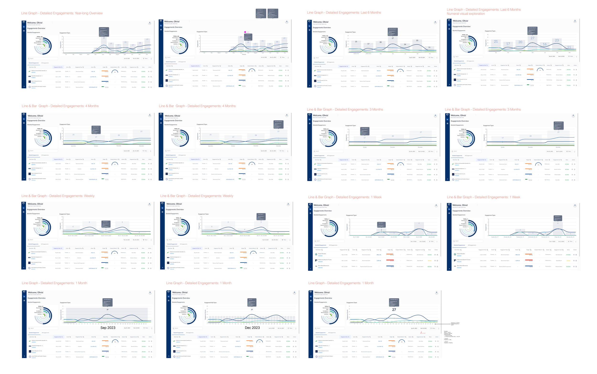
I conducted thorough research to analyze the behavior and visualization of various charts and graphs, identifying those that could be effectively implemented with our resources while addressing user needs. This research guided my design iterations, ensuring they were both practical and aligned with key user insights.
Following this research, I explored various visual iterations by prototyping different chart types (e.g., line, bar, radial graphs) to find the most effective way to represent engagement data. Each chart type was assessed for its strengths and weaknesses in terms of clarity, interactions, and data representation.
For example, line charts proved excellent for showing trends over time, while radial graphs provided a clear snapshot of proportional data.


IMPLEMENTATION & TESTING
PRIORITY ELEMENTS & ITERATIONS
DEFAULT DISPLAYS & CHART FREQUENCY:
Default View: 6 months
Time Frame < 1 Month: Daily frequency
Time Frame > 1 Month: Monthly frequency
DYNAMIC CHART BEHAVIOR:
Exploration of chart visualization and functionality in tandem with engagement table below
INTERACTIVE TOOLTIPS:
Implementing tooltips for immediate data insights upon hovering over the charts
ENGINEERING HAND-OFF
After aligning on the top three priorities and execution strategies, I prepared the engineering handoff by organizing design elements in Figma, adding annotations for interactive components, and documenting expected behaviors for testing. To ensure a smooth transition, we reviewed the design intent and confirmed feasibility for the upcoming sprint. We also used Confluence to track progress and address questions promptly.


IMPACT
I collaborated closely with our Product Design Director, who provided strategic direction and feedback, ensuring our design approach aligned with the overall product vision. Additionally, I worked with the Product Manager, who curated user stories and managed engineering sprints to develop my design enhancements effectively.